Flexbox Theory - Understanding the Core Concepts
Master the main axis, cross axis, alignment, and wrapping in Flexbox
When we add display: flex to a container, we unlock a powerful layout system that thinks differently than traditional CSS. This guide will walk you through every core concept you need to master Flexbox.
Flex Direction — How Flexbox "Thinks"
When we add:
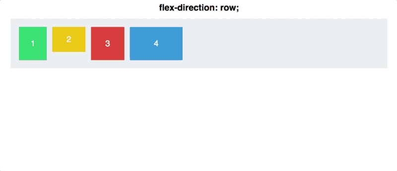
display: flex;
Our items suddenly stop behaving like paragraphs in a document and start behaving like puzzle pieces that want to line up.
By default, Flexbox chooses a row — everything goes left → right.
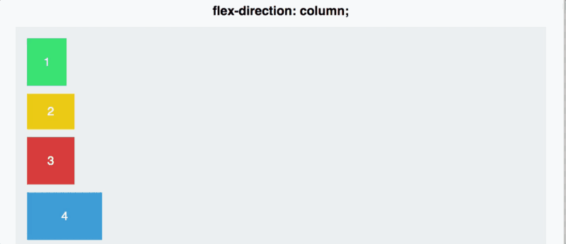
But with one small change:
flex-direction: column;
Items flip and start stacking top → bottom.
This is our first superpower: we control the direction.
Main Axis vs Cross Axis — The Flex Mindset
Before we go further, we need to understand the idea Flexbox is built on.
Flexbox doesn't talk about "horizontal" or "vertical".
Instead, it uses:
- Main axis → the direction your items flow
- Cross axis → the direction perpendicular to it

With flex-direction: row
- Main axis = left to right
- Cross axis = top to bottom
With flex-direction: column
- Main axis = top to bottom
- Cross axis = left to right
Important: Switching to
columndoesn't "align on the cross axis instead". It literally rotates the main axis. All Flexbox rules rotate with it.
This is why Flexbox feels so smart — learn the rules once, and they work in both directions automatically.
Default Flexbox Rules
Once Flexbox is activated, two things happen by default:
- Main axis: items stick to the start
- Cross axis: items stretch to fill the container
No magic — just the rules of the algorithm.
Reverse Directions
Flexbox also lets you flip the direction entirely:
row-reversecolumn-reverse
The order flips along the main axis, nothing else changes.
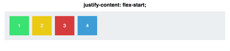
Alignment on the Main Axis — justify-content
Now that we know what the main axis is, we can control how items are spaced along it:
justify-content: <value>;
Here, we stop thinking "align one item" and start thinking "arrange the group".
Available values:
flex-startcenterflex-endspace-betweenspace-around
Two tricky ones:
space-between
Equal space between items, none at the edges.
space-around
Equal space around each item — edge spaces look smaller because each item contributes half.
Reminder: >
justify-contentworks along the main axis, and the main axis depends onflex-direction.
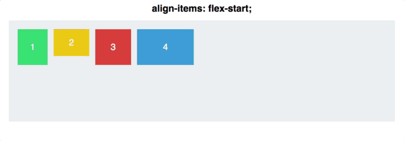
Alignment on the Cross Axis — align-items
When we swap to the cross axis, the property changes:
align-items: <value>;
Available values:
flex-startcenterflex-endstretchbaseline
The shared ones
flex-start, center, flex-end behave exactly like justify-content, but vertically when the main axis is horizontal.
The new ones
stretch
Items stretch across the entire cross axis.
baseline
Aligns items based on the baseline of their text, not the bottom of their boxes.
Baseline — Clear, Simple Rules
Baseline depends on what's inside the element.
Case 1 — The element has text
Baseline = the line the text sits on.
Case 2 — No text inside
Baseline = the bottom of the box.

This is why empty squares align along their bottom edge in baseline mode.
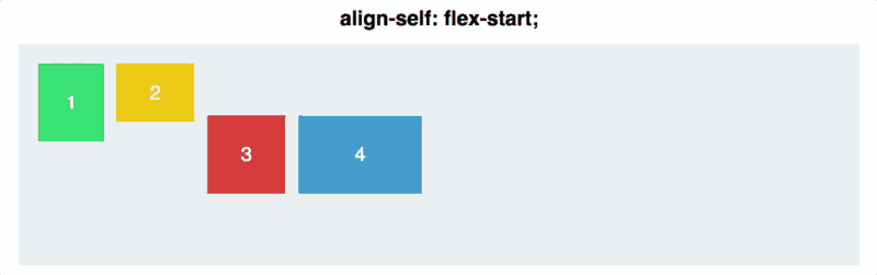
One Item Playing by Its Own Rules — align-self
Sometimes you want one specific item to break free.
align-self: <value>;
It overrides align-items for just that item.
Same values:
flex-startcenterflex-endstretchbaseline
Notice: There is no justify-self in Flexbox. To understand why, check out Josh Comeau's explanation on content vs items.
Wrapping — flex-wrap
Until now, all our items sat on one line.
But what if there isn't enough space?
flex-wrap: wrap;
Items will jump to the next row (or column).

This is useful for:
- Tags
- Cards
- Menus
- Responsive lists
For real 2D layouts, Grid is better. But Flexbox wrapping has very useful moments.
The Big Insight: Hypothetical Size
This is one of those mind-opening Flexbox concepts.
If you write:
.item {
  width: 2000px;
}
You might expect a giant 2000px box.
But in Flexbox, width becomes a suggestion, not a command.

Flexbox first calculates:
What size should this item be in a perfect world?
That's the hypothetical size.
But then Flexbox checks real constraints:
- Container size
- Siblings
- Available space
If things don't fit, items automatically shrink.
This is the Flexbox philosophy:
Everything is flexible. Layout adapts to reality, not fixed numbers.
Flex Basis — Sizing Along the Main Axis
Now that you understand hypothetical size, let's talk about how to set it properly.
You might use width to size an item, but here's the catch: width always affects horizontal size, even when your main axis is vertical.
Enter flex-basis:
flex-basis: 200px;
It's like width or height, but it follows the main axis direction:
- In a flex row → acts like
width - In a flex column → acts like
height
This matters because when you switch flex-direction from row to column, your sizing just works. No swapping properties.
Example:
.item {
  flex-basis: 300px; /* This adapts to your flex-direction */
}
It's the same principle as everything in Flexbox: think in terms of main axis and cross axis, not horizontal and vertical.
Want to see how it behaves with different values? Try this interactive visualization.
The Flex Shorthand — Growing to Fill Space
You'll often see this in real code:
.item {
  flex: 1;
}
This is a shorthand that tells an item to grow and fill available space.
It's especially useful when you want one element to stretch while others stay fixed—like a search bar that grows while the button stays the same size.
Example: Email subscription form
<body>
  <form style="display: flex; gap: 10px;">
    <input type="email" placeholder="Enter email" style="flex: 1;">
    <button>Subscribe</button>
  </form>
</body>
The input grows to fill space, the button stays fixed.

You'll use this in the collaborative project — Team 5 needs
flex: 1for their contact form input!
Wrapping + Alignment
When items wrap:
- Each "row" uses
justify-contentindependently - But the cross axis now spans multiple rows
This leads to more complex behavior.
For a great interactive visualization, check out Josh Comeau's wrapping section.
Session Recap
- Flexbox arranges items along a main axis
flex-directiondefines that axisjustify-content→ distribute along the main axisalign-items→ align along the cross axisalign-selfoverrides one itemflex-wrapallows multiple rowsflex-basis→ size items along the main axis (direction-aware)flex: 1→ make item grow to fill available space- Flexbox uses hypothetical size, not strict width
- Flexbox is fluid and adaptive by nature