Introduction - The Easiest Way to Stop Fighting With Layouts
Build an intuition for Flexbox from scratch - no experience needed, just a clear understanding of what it does and why it exists
If you've never touched web development before, CSS can feel a bit. magical. You write a few words, reload the page, and somehow everything moves around.
But here's the truth: Web browsers follow specific layout rules. Flexbox is one of the simplest and most powerful of these rules.
In this short intro, we'll build an intuition for Flexbox — no experience needed, no fancy theory. Just a clear idea of what it does and why it exists.
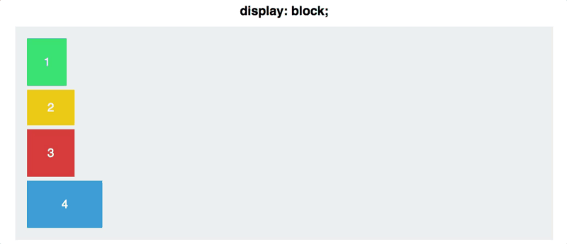
From "Document Mode" to "Layout Mode"
By default, the browser arranges things like a document editor:
- Titles and paragraphs stack vertically
- Text flows from left to right
- Everything follows a simple top-to-bottom structure
This is great for articles, but not great when you want to build web pages.
Now look what happens when we tell CSS:
display: flex;
That one line changes everything.
It tells the browser:
Stop placing things like a document. Start placing them like a row or a column.
This switch creates a new kind of layout environment called a flex container.
So What Does Flexbox Actually Solve?
Imagine you want to place:
- some buttons in a row
- a navigation bar
- cards that should adjust to screen size
- items that stay centered (finally!)
Doing this with the default layout rules is a nightmare.
Flexbox fixes that.
It lets the browser automatically organize items depending on the space available.
Think of it like this:
Flexbox is a smart system where items can grow, shrink, and align themselves depending on what the container needs.
You don't need to calculate widths. You don't need to push things with random margins. You don't need to guess.
Flexbox in One Sentence
Flexbox arranges items in a row or a column and gives you simple tools to control how they use space.
That's it.
Later, you'll learn how to:
- change direction (row/column)
- center elements perfectly
- push items apart
- make items grow or shrink automatically
But none of this is hard — Flexbox was literally designed to make layout easier.
Why This Matters for Your Web Project
If you want your page to look organized — buttons aligned, sections clean, items flexible — you'll need Flexbox.
In fact, Flexbox is so powerful that most modern websites rely on it everywhere.
In our session, we'll explore:
- the core Flexbox properties (only the ones you'll actually need)
- visual examples for each
- small exercises you can build and push to the repo
- how to use Flexbox in your own project layout
Ready to Learn the Easiest Layout System in CSS?
Let's dive in, starting with that one magical line:
display: flex;
Everything else builds naturally from this.
Now let's break Flexbox down step by step, with visuals and examples — and trust me, by the end, you'll feel like you've unlocked a new superpower.